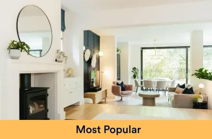


Decorating a space gives it a completely new feel, even if it’s just changing the colour of the woodwork. You can make it feel cleaner and airier; or darker and more intimate. There’s so many options that you could go for so we’ve spoken to our friends at COAT Paints who have done the hard work for you, bringing you the top colour trends for 2022.
COAT Paints create on-trend colours and have a curated palette of 56 colours, making it that bit easier to find your perfect shade. We spoke to Aaron Markwell, COAT’s colour guru to get the low down on what’s hot this year and what to pair them with.
Want 5% off our favourite climate friendly paint brand? Use our exclusive code ‘MBR5’ to get 5% off COAT paint
Greens

Park Life by COAT Paints. Image credit:@apartmentapocathecary
“The idea of bringing the outdoors in has been around for a while and it’s not going anywhere. Greens are harmonious with the world outside and we all need a bit of that right now, so COATing your walls and getting your fingers green is definitely the way to stay ahead. I love the way greens reflect the natural world, it gives you the chance to bring life and growth into your home” says Aaron.
“Sage greens like Park Life and Yard Party have become an extremely popular choice. We’ve seen a lot of people use these lighter grey-greens as alternatives to white recently. With an increasing awareness of the benefits of spending time in nature, these greens help create a calming effect that is perhaps lost with a shade of white.
If you love green, but don’t want to live in a completely green room, The Trail is a colour you’ll love to wander into. A restful green grey, it’s a clean neutral with a green undertone, making it a lifting addition to your space”, says Aaron. “Combine with deep wood tones like wenge and rosewood, brass accents and natural linen tones for a Japandi scheme with added depth.”
The new found love for sage does not mean that dark greens have been put in the corner, deeper tones like Mansard and Nomad continue to be classics and will make your friends green with envy.

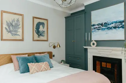
Image credit: My Bespoke Room
My Bespoke Room’s beautiful mood board by Ria uses Nomad and Pampas with sage bedding and coral contrasts.
Want help creating your own dream outdoor space? Book a free call to learn about how one of our designers could help:
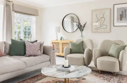
Warm neutrals

Cargo by COAT Paint. Image credit:@18thhomeonthestreet.
“The COAT community are big fans of a neutral shade and can’t get enough of them. So we don’t need to talk about the obvious timelessness and versatility of neutral shades. Easy, no stress, reliable and nuanced enough to be interesting.” Says Rob Abrahams. “They can shine in their own right to create calming spaces, or provide the perfect backdrop for other elements of the room to shine – like furniture or artwork.”
“Although this year will see a lot of people experimenting with colour, neutrals will by no means be taking a backseat. Instead, there will be a shift towards earthy neutrals, creating a cosy and friendly environment that you’ll never want to leave. Think warm beiges, greeny greiges, plaster tones and taupes all making another round of the interiors gamut.”
“Cargo is a highly anticipated neutral, as it is a green and yellow undertoned greige. This versatile colour lends itself to both the japandi and biophilic design movements, and is a sure match for those of you that like green, but don’t want to commit to a saturated sage or deep, duck green. The best backdrop for all things nature inspired: think linens, tanned leathers, teak mid-century furniture”, says Aaron.
 Image credit: My Bespoke Room
My Bespoke Room designer Celine used a really interesting choice of fabric which ties Safe Play and Humble together in a really unexpected way, using neutrals creatively.
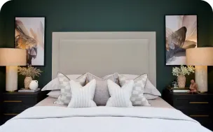
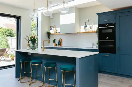
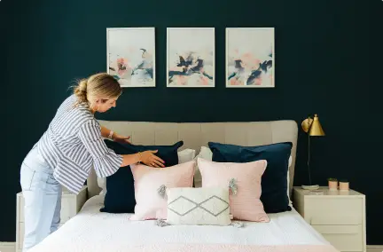
Bold blues

The Posh Seats by COAT Paints
“Blue is usually associated with relaxation and peace and this is certainly the case with light, paler blues which have been popular for years. However this year we’re seeing something a bit different, a new sense of joy and freedom is being expressed via vibrant blue tones and bold patterns. As we move into a year of renewed optimism, one of the major trends for 2022 is to embrace bold colours and brighter blues in particular.”
“The Establishment is the first dark blue we’ve released that doesn’t contain any green pigment. It’s the most stable blue in our palette because it doesn’t have any undertones apart from grey. This means it will work under any lighting conditions, making it a really versatile colour.
For braver decorating fans that want a blue, there’s another corker in our new palette. The Posh Seats is an indulgent peacock blue. Its slight green undertone adds a subtle touch of warmth. It’s brazen and regal, and really does show off!” Says Aaron. “Use black frames around pictures on The Posh Seats walls, which tricks your eye into thinking it’s a brighter colour than it is. Also denims, grey linens and plush midnight and navy’s work really well in combination with this bold blue!”
Need help deciding on the perfect colour for your home? Book a colour consultation with COAT’s colour guru, Aaron, to talk about everything from trends, wall paint, exterior refreshes and colour combinations. Head to coatpaints.com to order their ‘Peel & Stick’ swatches, the eco-friendly way to test paint.
Inspired to transform your outdoor space? Book a free call to learn about how one of our designers could help:
